Conversion rate is the share of visitors who buy. Most stores sit between 1 and 2 percent. Below 1 percent, something is usually broken rather than merely unoptimized.
Fix the known problems before you test anything. The changes that move the number most come first.
Show shipping cost early
Unexpected shipping cost at checkout is the most common reason carts get abandoned.
- 🚚Put the cost or the free-shipping threshold on the product page, not the cart.
- 📅Show a delivery date, not a vague "3 to 5 working days".
- 🌍If you ship abroad, show the cost before checkout. Surprise duties kill orders.
- 📄Link a plain shipping page from the footer and the product page.
If you cannot promise a date
Stores that ship from a supplier or hand off to a carrier often avoid dates because delays are out of their hands. An estimate with an honest caveat still beats a range of working days, because the shopper does not have to do the arithmetic.
- 📅Write "Estimated arrival October 14 to 17", not "ships in 3 to 7 days, transit 4 to 14 days".
- 🚚If you offer a faster option, show its date next to the standard one so the choice is visible before checkout.
- ℹ️Add one short line: "Estimates depend on the carrier." That is enough to cover you.
- 🎁Shoppers buying for an event need this most. If the date is missing they assume the worst and leave.
Make the site fast on mobile
Most traffic is mobile and most stores are slow there. Test the real thing, not your laptop.
- ⚡Run PageSpeed Insights on a product page. Aim for Largest Contentful Paint under 2.5 seconds.
- 🖼️Compress hero and product images. They are almost always the biggest offender.
- 🧹Delete apps you no longer use. Every one leaves script behind.
- 🎞️Drop carousels and autoplay video above the fold.
Fix the product page
This is where the decision happens. Start with the button, then the information a shopper needs to press it.
The first screen, in order
A shopper runs a mental checklist: is this the one, is it my size, what does it cost, when will it arrive, can I send it back. Answer those in that order, on the first screen, and put the button where the answers end.
- 1️⃣Images on the left on desktop, at the top on mobile. The first image is the product on its own, clearly lit.
- 2️⃣Title, then price directly under it. If there is a discount or a first-order offer, show it here, next to the price.
- 3️⃣Variant pickers next: size, color, and any other choice. Mark sold-out options instead of hiding them.
- 4️⃣Stock status beside the pickers, and only if it is true.
- 5️⃣The buy button, with pay later options under it if you offer them.
- 6️⃣One line each for delivery and returns, directly under the button, linking to the full policy.
- 7️⃣Everything else goes below: description, materials, size chart detail, reviews, related products.
On desktop all seven should fit without scrolling. On mobile that is rarely possible, so keep the title, price and pickers on the first screen and use a sticky bar so the button never leaves it.
The most common mistake is putting a long description between the price and the pickers. The shopper has to scroll past three paragraphs to choose a size, and the delivery and returns answers sit in a tab most people never open.
The buy button
- 👆Add to cart visible without scrolling, on mobile as well as desktop.
- 📌Make it sticky, so it stays on screen as the shopper reads down the page.
- 🎨Give it a color nothing else on the page uses. If it blends into your theme, it is not a call to action.
- 🏷️Price next to the button, with any discount shown as the old and new price.
- 💳Show buy now, pay later options here, not at checkout. On higher-priced items it changes whether people start at all.
The information underneath
- 📸Six or more images, including scale, detail and in-use shots.
- 📏Sizing or spec details on the page, not in a linked PDF.
- 📦Stock status and delivery date near the buy button.
- ↩️Returns terms in one line by the button, with the full policy linked.
- ⭐Reviews on the page. Even a handful beats none, and mixed ones read as genuine.
| Loses the sale | Wins it | |
|---|---|---|
| First screen | Vague title, price further down, no delivery information. | Clear title, price and delivery date visible without scrolling. |
| Images | One or two shots on a white background. | Several angles, something for scale, and the product in use. |
| Reviews | None at all, or a flat five stars with no text. | Real reviews with words in them, including the mixed ones. |
| The button | Blends into the theme, scrolls off the screen. | High contrast, sticky, and says Add to cart rather than Submit. |
| Speed | Heavy images and a carousel above the fold. | Loads fast on mobile data, with a layout that does not jump. |
Put your offer where the decision happens
A first-order discount that only appears in a popup is easy to dismiss and then impossible to find again. If you run an offer, treat it as product information.
- 🏷️Show the offer next to the price on the product page, not only in a popup or the footer.
- 🛒Apply it automatically or show the code in the cart. A code the shopper has to hunt for is a reason to leave the page.
- 🛍️If you advertise on Google Shopping, add the offer as a promotion in Google Merchant Center. Google then shows a special offer tag on your listing, before the shopper has compared you with anyone else.
- ⚖️Keep it true and keep it modest. A permanent 50 percent off reads as a price that was never real.
Cut checkout friction
Shopify's checkout is already better than most, so there is less to win here than on the product page. Check the basics, then stop.
- 👤Enable guest checkout. Forced account creation loses orders.
- 💳Offer Shop Pay, PayPal and Apple or Google Pay. Wallets convert better on mobile.
- 📝Remove every optional field. Ask for nothing you will not use.
- 🔢Show progress if checkout runs to more than one step.
Then find where people actually leave rather than guessing. Shopify's behavior reports show how many reach the cart, start checkout and finish it.
- 📉Big drop from product page to cart: the page is not convincing, or the price surprized them.
- 🛒Big drop from cart to checkout: shipping cost or delivery time appeared too late.
- 🚪Big drop inside checkout: a payment method is missing, or a form is asking too much.
Fix the biggest gap first. One real drop-off is worth more than a list of small improvements spread across the whole journey.
Recover abandoned carts
- ✉️Send the first email within an hour, a second after a day.
- 🖼️Show the actual product and a direct link back to the filled cart.
- 🚫Do not lead with a discount. You will train people to abandon on purpose.
Make search and navigation work
- 🔎Check your site search for your ten best sellers. Misspellings should still find them.
- 🗂️Keep categories shallow. Three clicks to any product is plenty.
- 🎚️Add filters once a category passes about 40 products.
Channels convert at very different rates
A single site-wide number hides more than it tells you. The same store can convert well on one channel and badly on another, and the average sits in the middle looking fine.
- 🔗Direct and branded search convert highest. These people already knew who you were.
- ✉️Email is next. You are selling to people who already bought or asked to hear from you.
- 🔍Paid and organic search sit around the middle. The visitor wants the product but not necessarily from you.
- 📱Social is usually the lowest by some distance. Nobody opened the app to shop.
As a rough rule, 1 percent or better is healthy for a channel. Below 1 percent, treat it as a problem to investigate rather than a number to optimize.
Judge each channel against itself over time. Comparing your social traffic to your email traffic will only tell you they are different, which you already knew.
Measure it properly
Site-wide conversion rate hides more than it shows. Break it down before you act.
- 📊Split by device. Mobile is usually half of desktop, and that gap is the opportunity.
- 🧭Split by traffic source, and compare each channel against its own history.
- 🛒Watch cart-to-checkout and checkout-to-purchase separately. They fail for different reasons.
Conversion rate and order value together decide what each visitor is worth, so it is worth raising your average order value at the same time.
A note on A/B testing
Most stores cannot test reliably. You need thousands of conversions per variant to trust a result, and a small store will call a random fluctuation a win.
Fix known problems instead. Slow pages, hidden shipping costs and forced accounts are not worth testing, they are worth fixing.
Apps worth looking at
Prices and ratings are as of September 2026 and change over time, so check before you install.
Judge.me Product Reviews
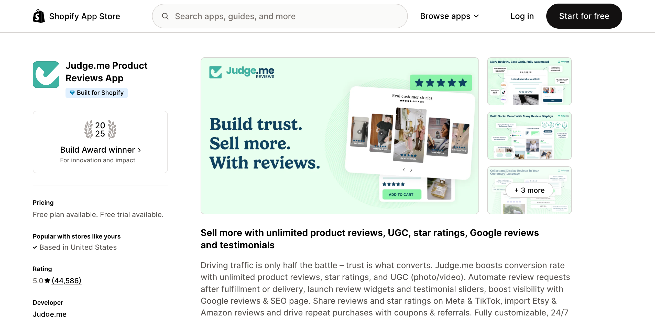
- ⭐Unlimited reviews with photo and video, plus star ratings in Google results.
- 💵Genuinely free tier with unlimited reviews. Paid plan $15 a month, not usage-metered.
- 👍5.0 from 44,586 reviews, the largest review base on this list by a distance. Praise is for fast setup and review requests that actually send. Complaints are mild.
View Judge.me on the Shopify App Store
Loox, if you want it to look better
- 📸Photo and video reviews in more polished widgets than Judge.me.
- 💵Free to 500 orders. Then $49.99 a month including 300 orders, plus $50 for every extra 300.
- ⚠️4.9 from 9,177 reviews, but the overage stacks fast. One merchant on the $49.99 plan reported a $399.99 charge. Prettier, and much riskier on the bill.
View Loox on the Shopify App Store
Omnisend for abandoned carts
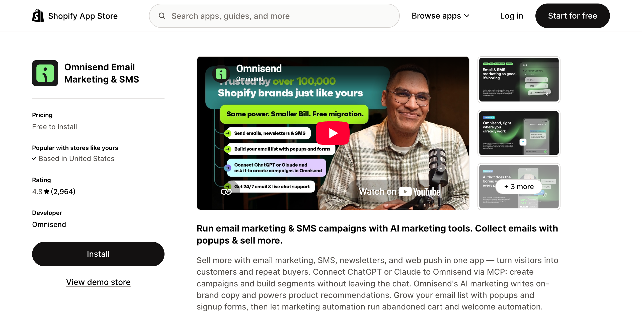
- ✉️Abandoned cart and post-purchase automations across email, SMS and web push.
- 💵Free to 500 emails a month. Standard $16 a month, Pro $59. Scales on contacts.
- 👍4.8 from 2,964 reviews. Easy to learn without email experience. The recurring complaint is support going quiet on real bugs, and downgrades needing a live chat rather than a button.
View Omnisend on the Shopify App Store
Klaviyo if you have outgrown that
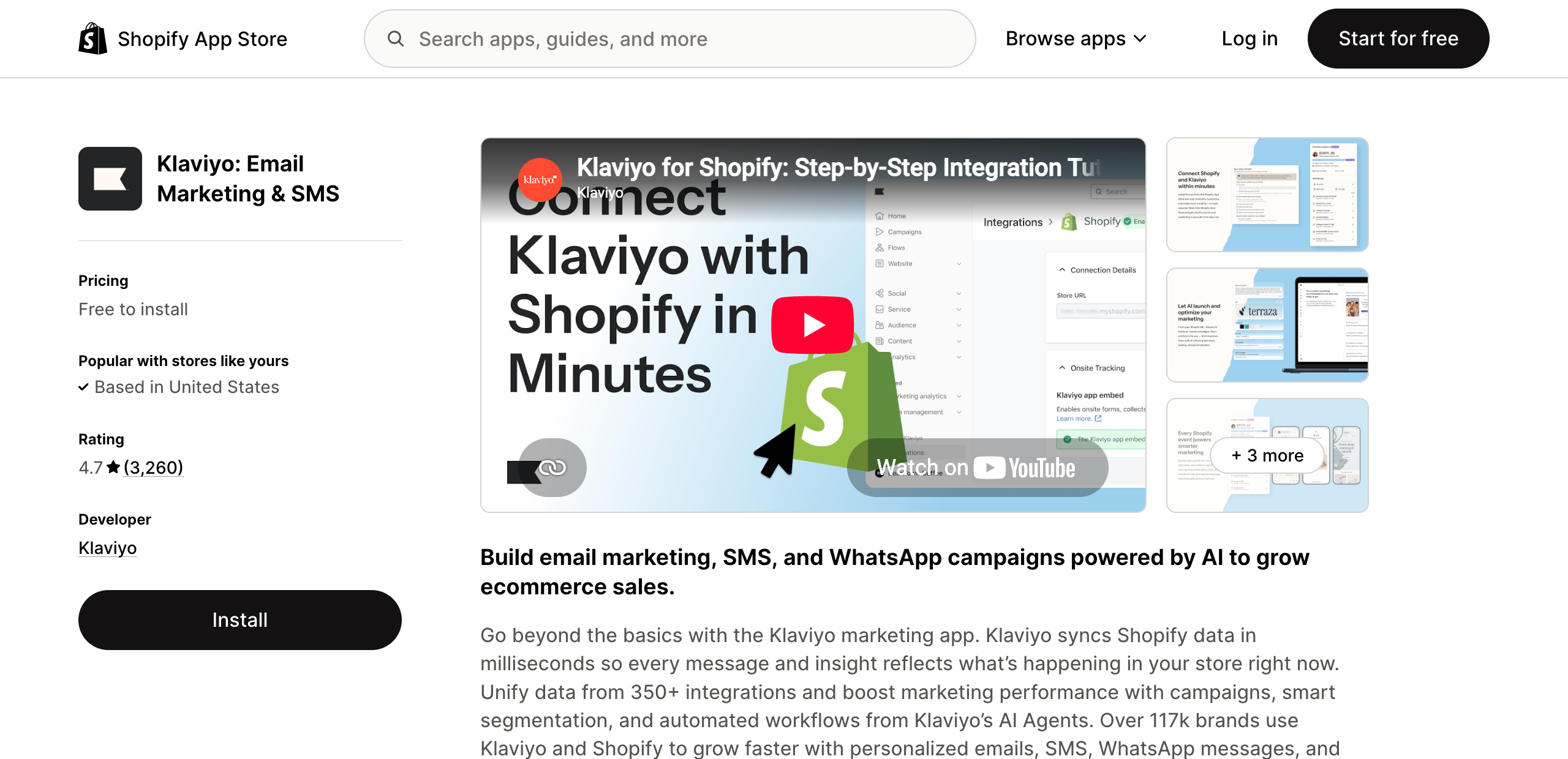
- 🧠Deeper segmentation and flows, built on your Shopify order and browsing data.
- 💵Free to 250 contacts. $20 a month at 500 contacts, and it climbs steeply from there.
- 👍4.7 from 3,260 reviews. People tolerate the price for the segmentation and the data sync. Cost is by far the most common complaint.
View Klaviyo on the Shopify App Store
Kiwi Size Chart, if you sell clothing or shoes
- 📏Size charts and a size recommender on the product page, so the answer sits next to the size picker.
- 💵Free plan available, with paid plans above it. Check how the paid tiers are metered before you upgrade.
- 👍4.7 from 1,239 reviews as of October 2026. Praise is for setup and how the charts look. Some merchants report bills rising sharply after a pricing change, so watch the first invoices.
View Kiwi Size Chart on the Shopify App Store
Pay later: start with what Shopify already gives you
- 💳If you use Shopify Payments in a supported country, Shop Pay Installments is built in. Turn it on and the monthly price appears under your product price with no app to install.
- 🧩Klarna, Afterpay and Affirm are the usual alternatives. Each has its own Shopify integration, and their on-page messaging apps are rated lower than the payment methods themselves, so read recent reviews first.
- 🎯It matters most above about $100. Below that, a wallet button does more than an installment plan.
Tiny SEO for image weight
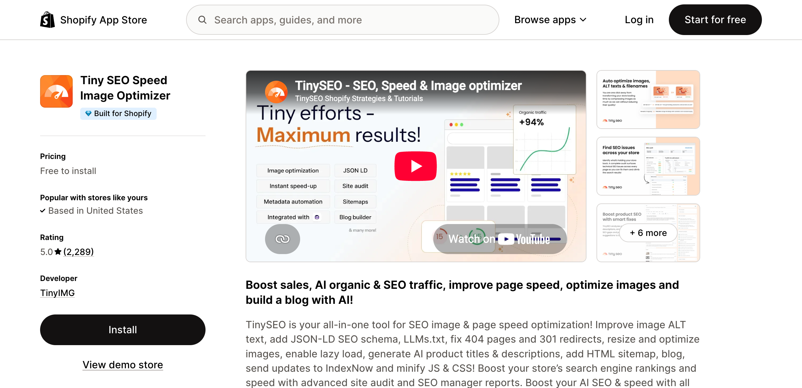
- ⚡Compresses images, lazy-loads them, and minifies JavaScript and CSS.
- 💵Free for 50 images a month, then 3 cents each. Paid from $14 a month for 1,500.
- 👍5.0 from 2,289 reviews. Notably, nobody reports it breaking images or themes, which is the usual failure in this category. Expect marketing emails after you uninstall.
View Tiny SEO on the Shopify App Store
Boost AI Search and Filter, for big catalogs only
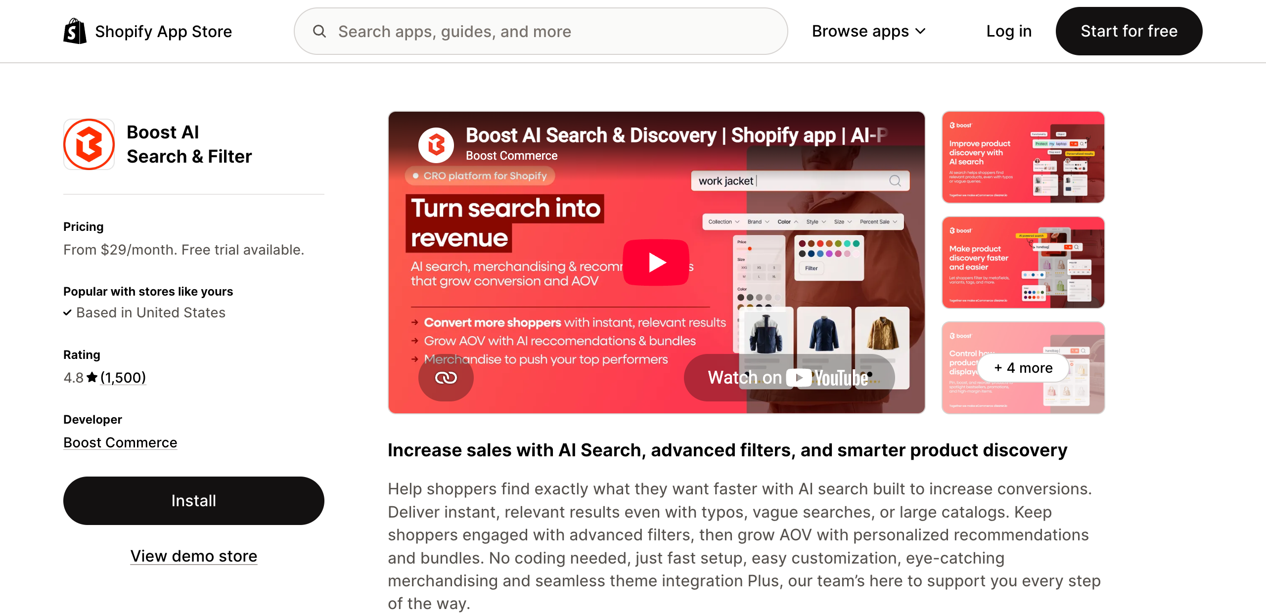
- 🔎Replaces Shopify search with typo-tolerant search plus tag and variant filters.
- 💵No free plan. From $29 a month, and it prices on your store's monthly revenue, not on searches.
- ⚠️4.8 from 1,500 reviews, and support is the thing people rave about. Because it meters on revenue, the bill grows as you grow. Not worth it under a few hundred products.
View Boost AI Search on the Shopify App Store
Easy to overdo
Urgency and popups both work when they are true and well made. Both do real damage when they are neither. The line is whether your store looks considered or looks cheap.
- ⏳Countdown timers are fine on a sale that genuinely ends. A timer that resets when the page reloads gets noticed, and then nothing else on the page is believed either.
- 📦Low stock warnings are fine when the number is real. Invented scarcity on every product is the clearest signal of a throwaway store.
- ✉️Popups convert when they arrive after someone has shown interest, on scroll or on exit, once per visit, and are easy to close. On arrival they interrupt a decision that had not been made yet.
- 🎨Whatever you use, it has to match the rest of the site. A badge or banner that looks bolted on drags the perceived quality of everything around it.
One of these, done well, is worth more than all of them at once. Stacked urgency reads as pressure, and pressure reads as a store that needs the sale more than you need the product.
Not worth your time
- ❌Full redesigns. They change everything at once, so when the number moves you cannot tell what did it.
- ❌Chasing a competitor's published conversion rate. You cannot see their traffic mix, and mix explains most of the gap.
- ❌Testing things you already know are broken. A slow page and a hidden shipping cost do not need an experiment.
The checklist
Work down it. Anything you answer no to is worth more than anything you could test.
- ☐Shipping cost or free shipping threshold is on the product page.
- ☐A delivery date is shown, not a vague range.
- ☐A product page loads in under 2.5 seconds on mobile data.
- ☐Title, price, size and color pickers are on the first screen, above the description.
- ☐Add to cart is visible without scrolling, and stays on screen as you scroll.
- ☐The button color is used nowhere else on the page.
- ☐Buy now, pay later is shown on the product page if you offer it.
- ☐Delivery and returns each have one line under the button.
- ☐Your best sellers show reviews on the product page.
- ☐Any discount or first-order offer is shown next to the price.
- ☐Guest checkout is on.
- ☐Shop Pay, PayPal and a mobile wallet are all enabled.
- ☐Every optional checkout field has been removed.
- ☐Abandoned cart emails go out within the hour.
- ☐Site search finds your ten best sellers, including misspelled.
- ☐You have looked at conversion rate split by device and by channel.
- ☐You know which step in the journey loses the most people.